
Moxie Sozo is a Design Company from Bolder Colorado. 1st product I bought of theirs is Late July, which was a rather tasty brand of chips.
Finding
high quality images of the products is rather hard, but look at the
color combinations, the font, and the vector graphics which have the
right level of gradients because if you go too far with gradients, then
it looks cheesy (cheesy here meaning not good). There is a very
wholesome appeal to this packaging that does lure you into the product.
The sweet potato one is the one I've had and it's as good as it looks.
Late July Website. Moxie's Late July PortfolioSo Today I picked up a box of Snackle Mouth Granola Nut Clusters.


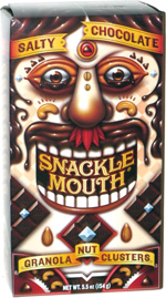
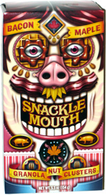
Moxie's Portfolio for Snackle Mouth.
While I've never tried the fallowing products I can only say that these are worth a try just based on the wonderful graphic work alone. How ever I'm not very impressed with some of the more, commercial work featured in their portfolio, there are obviously different teams that tackle certain products. However, there is someone with great skill at that company, and I could just stare at these packages for hours looking at how they did it all. Great work!


No comments:
Post a Comment